Toggle Sidebars using CSS and @keyframes
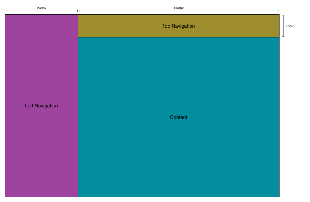
01 Aug 2015Most modern websites do have a navigation pane on their left side which contain a logo and links.
On small screens the size of such a navigation pane takes too much space on screen and should not be painted.
Hence, some smart people invented the so called “Hamburger”-Icon which indicates a user that the navigation can be toggled.
On most websites this mechanism is implemented using jQuery’s animate().
But the effect can be achieved by using CSS only.
One can think of adding different stati to the website, navigationIsHidden would be one of them.
So by adding <html class="navigationIsHidden"> the entire HTML document knows that the navigation bar should not be rendered and elements have to react on this state.
Other elements like top navigation or content area are allowed to increase their size to full window width now to close the gap which was used by navigation before.
html.navigationIsHidden {
    aside {
        position: fixed;
        top: 0;
        left: 0;
        width: 240px;
        right
    }
    topNavigation {
        padding-left: 0px;
    }
}

html.navigationIsHidden {
    aside {
        display: none;
    }
    topNavigation {
        padding-left: 0px;
    }
}